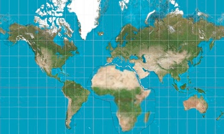
A while ago I tried to
make the case that its silly to get upset about the biases inherent in the standard mercator map. Among other things, I think it's misguided to say this projection devalues Africa by making the continent appear smaller, especially relative to places at higher latitudes like Greenland, Labrador or Spitzbergen. Africa, of course, looks smaller because it is in the very center of the map, which for much of history was considered pride of place. Also, saying that people would better appreciate Africa's importance if only it appeared larger on our maps is a bit optimistic. Those inclined to be condescending could just as easily argue that the larger Africa looks the more embarrassing it is that the continent isn't even more powerful. But still the carto-critics
persist, pushing the equally distorted
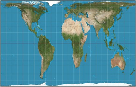
Peters map as a politically preferable projection. So rather than argue any more, I used MS paint to solve this problem for once and for all. Here is a Mercator map showing Africa at an appropriate size without the stretching that mars the Peters....
Africa, as soon as you're done thanking Bono, feel free to thank me too.