


In the 1950s, the men like Daniel Learner confidently analyzed the transition from "traditional" to "modern" society, charting all the many changes in worldview and values that would inevitably occur as cultures moved from the honor-bound, authoritarian grasp of tradition into the participatory, creative paradise of modernity. It was a reductive analysis, but in its own way it avoided assuming that certain religions, linguistic groups or races had any more capacity for being modern than others. All traditional societies, whether in Europe or Asia, were culturally similar, according to Lerner, and all modern societies, whether Christian, Muslim or Buddhist, would be culturally similar too. Unfortunately now it seems that far too often political scientists somehow manage to combine the simplistic determinism of Lerner's model with an even more regressive kind of cultural prejudice. One of the best recent examples is the following:
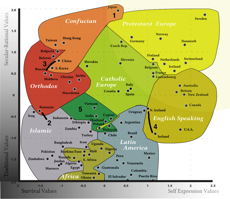
Published by Business Insider with the title "This Chart Explains Every Culture In The World." As the chart's authors explain: "A somewhat simplified analysis is that following an increase in standards of living, and a transit from development country via industrialization to post-industrial knowledge society, a country tends to move diagonally in the direction from lower-left corner (poor) to upper-right corner (rich), indicating a transit in both dimensions. However, the attitudes among the population are also highly correlated with the philosophical, political and religious ideas that have been dominating in the country." Indeed, with Sweden in one corner and Zimbabwe in the other, their somewhat simplified analysis seems safe enough, but they just can't resist adding a "cultural" dimension. Now setting aside the question of whether things like the World Values Survey actually measure anything meaningful or not, you could plausibly concluded, based on this map, that maybe there are some real cultural differences between Continental Europe, formerly British settler colonies and former/current Communist dictatorships. But what becomes immediately clean from looking at the map is that instead of grouping countries by even the most vague political, philosophical or historical criteria, the authors pretty much just went with religion. Consider some of the strange results this produces:
1) Japan gets classified as Confucian despite having much greater similarities, by the authors' own metric, to Protestant Europe
2) Romania is basically Muslim
3) Communism seems like a remarkably straightforward political/philosophical factor that might explain why China and Russia end up right next to each other. But instead this seems to reveal a previously unrecognized similarity between Orthodox and Confucian societies.
4) Northern Ireland is more Catholic than Ireland.
5) Poland somehow ends up in the grab bag category with India, Cyprus and Thailand.
Also, come to think of it, just how Muslim is Zimbabwe? And do they speak English in South Africa? It's hard to tell with the accent. Charts like this make you long for the days when people would just come right out with their prejudices by mapping the world according to General Progress.