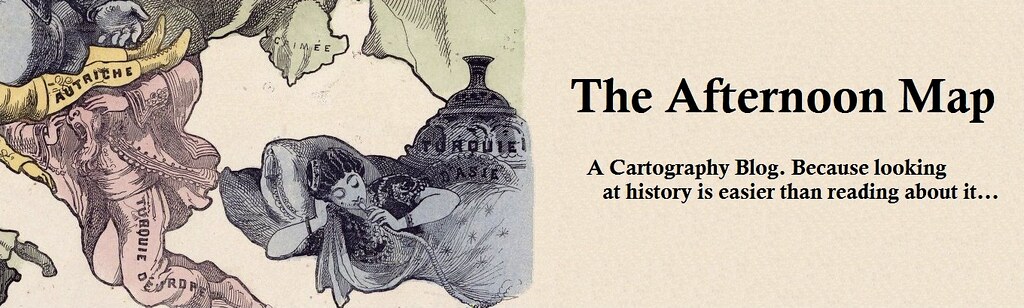


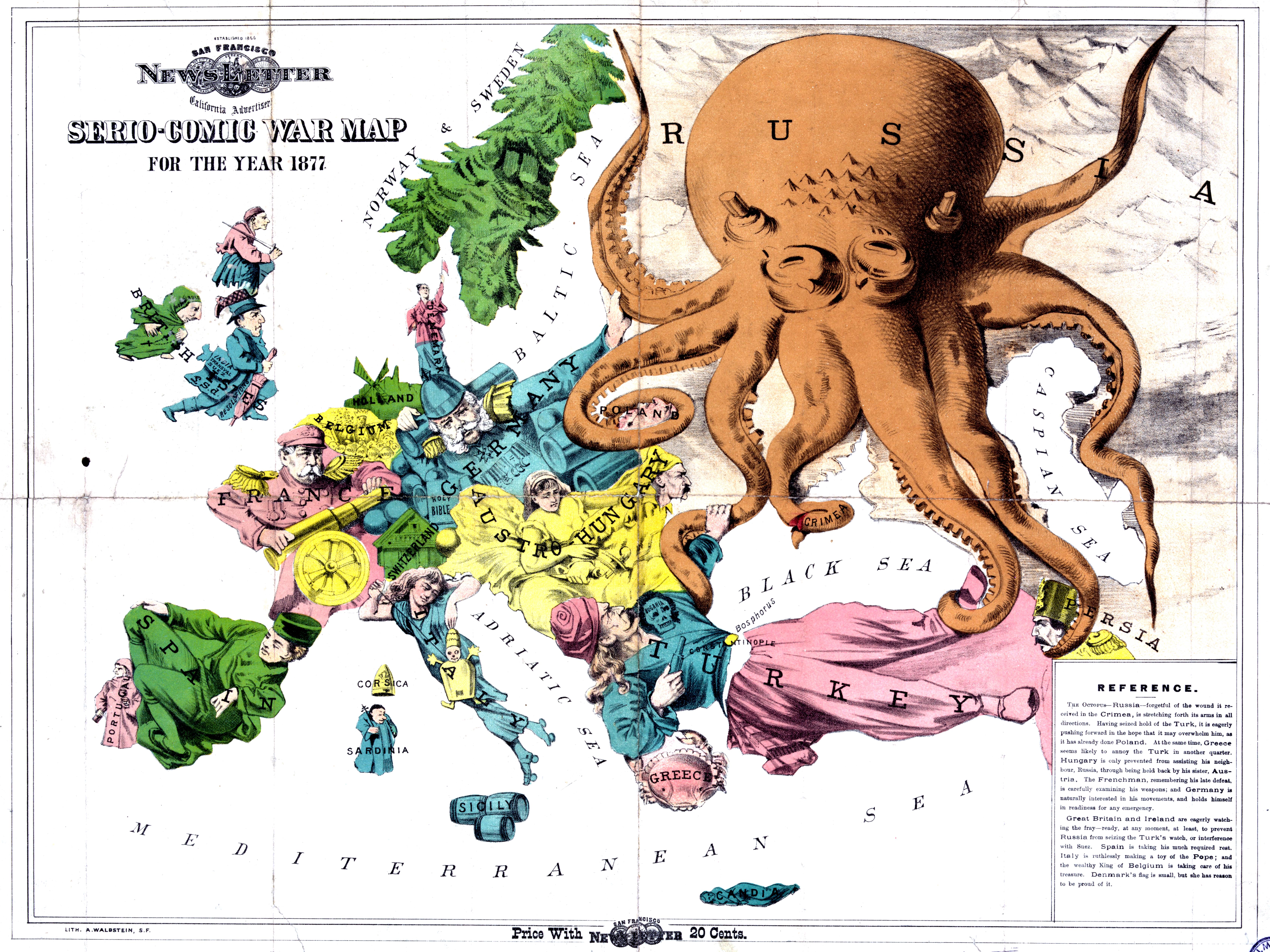
Today we have a guest post from Asher Kohn about an 1877 satirical map of Europe. For the full map, excerpted above, click here, or for more on the map octopus check out the incomparable Strange Maps.
San Francisco did not only become
the home to journalistic innovation in the 20th century, and Russia did not
only became the bete noire of the Western World after World War II. These two
maps -- the former from the San Francisco Newsletter of 1877, the latter from
Fred W. Rose of London in 1900 -- share some obvious similarities in their
anthropomorphic renderings of countries, fashionable şalvar worn by Turkey, and
belief in Russia as an evil octopus bent on dominating the world. But these two
maps can tell us a lot about both technological advancements in newspapers and
how Turkey was perceived for late 19th-century audiences. The maps cannot tell
us where to get such snazzy pants.
Anthropomorphic maps of Europe date
back to the 16th century, according to Rebecca
Maxwell, which coincides roughly with the beginning of a conception of
“Europe” as a Catholic entity. Anthropomorphic cartography has made its name in
the US by Rand & McNally’s “Man of Commerce” in
1889, but the Newsletter’s map predates this by 12 years.
By the time the 1877 map was created, California
had been a state for 27 years but William Randolph Hearst was a decade away
from buying the San Francisco Examiner and turning America’s “Yellow Journalism” era into full gear.
The Californian public was interested in foreign affairs, and creative
journalists were able to assemble wire reports into graphical depictions,
similar to current-day fads of “graphic” or “explainer” journalism. The map
even calls itself “serio-comic,” perhaps a precursor to the “serious-casual” style of writing that
is popular today. It’s depth-of-color comes from simple color blocks printed
onto a cross-hatched lithograph.
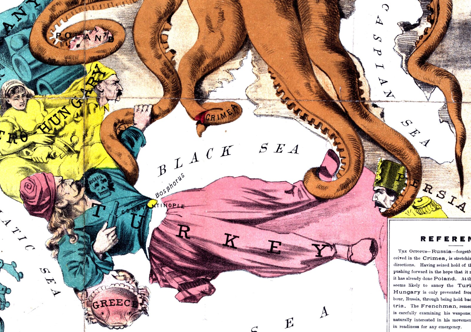
In the map, Turkey is dealing with a veritable
meze platter of enemies. The crab of Greece pinches the Ottoman Empire’s elbow
while the golden-haired Turk tussles with the Russian octopus. The deaths-head
labeled “Bulgaria” is supposed to represent the brutally-suppressed April Uprising, while the
partially-detached Crimean tentacle portrays the Russian Empire’s losses in the
Crimean War of the 1850s. Russian dominance of the Caucasus is hinted at by the
octopus’ stranglehold of Naser al-Din Shah Qajar, and the complicated story of
the Balkans’ tangle is represented by a militaristic man held back by his
sister.
Turkey looks strangely like American general
George Custer, who died in pitched battle against a Plains Indian alliance the
year before. His fight with Russia is clearly the focus point of the map as the
traditional European powers of Britain, France, and Germany watch the struggle
warily. The San Francisco cartoon portrays a world of perilous balance and
neutrality that can be overturned with a shift of the Turk’s feet. Read more and see more maps after the jump...

By 1900, advances in color printing meant that
multiple colors could be printed on a single lithograph, allowing for greater
depth of color. This, along with the popularization of halftone, allowed for more
portraiture, which Fred Rose took advantage of for his own serio-comic map. As
a Britisher, his caption reads a bit like, well, the sort of person who would
draw a be-sideburned John Bull with an Irish woman bedeviling him. Every
anthropomorphized European looking up at him either hopefully or jealously also
gives the plot away a bit.
Russia’s tentacles have become more targeted
than exuberant, reaching into a (queasy to 2014, perhaps) personification of
Asia as well as into Afghanistan as we have entered the high Great Game. That said, the Crimean
tentacle has seemingly been chopped off at the nub, which may symbolize
British-enforced Black Sea neutrality or may simply be an artistic decision. As
for the collapsing Ottoman Empire, the baby states of Serbia, Bulgaria, and
Romania are represented, and Greece -- no longer just a crustacean -- is
represented by the terrified and luxuriantly-mustachioed visage of the
Copenhagen-born King George I. The Empire is now simply “Turkey” to Rose, and
is represented by a reclining Abdul Hamid II recognizable more by his fez and frock coat than by his visage. The
Qajari Muzaffer ed-Din Shah has been decapitated, but his headware has upgraded
to a fine papakhi. Austria has undergone a gender change, and that empire’s
brothers have turned their anger westwards.
These historical documents may appear more
“comic” than “serio” today as they try to mash together complicated geopolitics
into an almost Gilbert-and-Sullivan style of exaggerated
emotional registers and tangled social relationships. However in the late 19th
century, lay people were for the first time getting involved in foreign affairs
and were for the first time receptive to newspaper discussion (and
manipulation) of such. Much like the explainers and oversimplifiers that are
ridiculed by regional experts -- self-styled or not -- today, these
anthropomorphic maps were a way for individuals who couldn’t locate Bulgaria on
a map to obtain at least a passing understanding of the state-of-play in
Europe.
The advances in technology could paint a
prettier picture of the region, but the true depth of the reporting lies in the
caption. The facts underlying these maps could be manipulated to bring out the
desired emotions and politics of its audience. Colorful and simplified imagery
is a means towards journalistic understanding, not an end. Remember that when
your eyes are drawn to the recent journalistic trends. Or the next time you see
an octopus representing Russia.